


Table of Contents

In the 1950s, when McDonald’s was starting to expand, its founders installed two giant golden arches framing the restaurant. The sign attracted drivers from miles away and became a success in no time. Later on, it evolved into the famous “M” we know today, presenting one of the leading restaurants in the food industry.
It’s a simple and game-changing story about how crucial a sign can be. Are you wondering how to design a business sign that will make a similar mark? Read on and browse through our sign design tips. We’ll help you create a unique sign to top the competition.
Key Takeaways
- A business sign is a key marketing tool. It increases brand visibility and spreads messaging for customers walking by or driving miles away.
- Good readability is a must for effective signage. The bigger the signage, the more noticeable it is from a distance.
- Color is one of the inseparable elements of sign design tips. Marketing color psychology offers contrasting hues to get sharp and catchy designs.
- Impactful business signage design demands simple typography, blank space, strong CTAs, and a well-organized messaging hierarchy.
Need to Design and Print Your Sign?
As an online sign maker, Square Signs offers a wide selection of business signs with custom sizes, personalized printing, various application methods, and other options you may desire. Visit our custom signs page to choose the product that best presents your brand.
Explore Custom SignsWhat Is Signage Design?
Signage design involves planning and creating signs that help people understand information, navigate spaces, and recognize a brand. It combines visual design, marketing, and psychology to produce signs that are easy to read, visually appealing, and effective. The goal is to create a positive impression, communicate your brand’s story, and improve how people interact with your business.
Why is Effective Signage Design Important?
Your business sign speaks about your brand before you do. With effective signage, you’ll gain foot traffic faster than expected. Here's how good signage design can open new doors for your business.
1- Increases Visibility and Brand Recognition
A business sign is the silent ambassador of any brand, working 24/7. It’s the first thing people notice about your business.
2- Helps Drive Sales and Impulse Buys
Well-crafted signage builds trust and curiosity in customers. It has strong messaging and color psychology.
3- Tells the Brand Story and Important Messaging
Tell your brand’s story with impactful signage. Keep it concise and precise without exaggerations. Most customers like to know how you got started.
4- Improves Brand Perception
Your business sign is often the first thing customers see. The more professionally it’s crafted, the better impression you’ll make.
Today, a brand’s visual identity isn’t limited to storefronts or billboards. The same design principles apply across digital formats like websites, email signatures, and digital business cards, where consistent typography, color, and logo placement help maintain recognition. Whether it’s a printed banner or a digital asset viewed on a phone, cohesive design ensures your business looks professional and trustworthy everywhere it appears.
How to Design Effective Business Signs
To have a business sign that truly works, you have to design it both enthusiastically and strategically. Here is a breakdown of the best sign design tips you need to consider.
Prioritize Readability and Clarity
One of the most useful business signage tips is to use the right sizes to make your sign readable from a distance. The chart below shows the optimal sizes for effective business signage and readable distances. They might differ depending on the color and design of the sign.

Pick Contrasting Colors
Exploring the color psychology of business signage is more than just picking a random hue. Colors trigger emotions and attract faster than any messaging does. Find the most successful colors in marketing, their meanings, and world-leading brands that thrived with their logos:

Nevertheless, these colors won’t lead you to triumph if you don’t implement them wisely. An impactful signage logo needs to contrast with its background for the best visibility and brand consistency. Some good color contrasts are:
Good Contrasts:
- Yellow, white & black - reveals friendliness (e.g, Nikon);
- Red & orange - represents life and vitality (e.g., Mastercard);
- Green & orange - shows taste and appetite (e.g., Crush Orange);
- Red & black - speaks about premium features (e.g., Netflix);
- Red, black & white - presents energy and boldness (e.g., Youtube);
- Pink & white - shows youth and femininity (e.g., Victoria’s Secret);
- Different shades of green - present wildlife, sustainability (e.g., Animal Planet).
You can find millions of similar color combinations that have changed the corporate world. Here are some examples of signage colors done both right and wrong.

Choose Simple Typography
When it comes to the typography of business signs, simplicity is key. Avoid using extravagant fonts that create challenging readability. I’ve listed the best and worst business sign fonts for you.
| Best Fonts | Characteristics | Worst Fonts | Characteristics |
|---|---|---|---|
| Helvetica | Neutral, highly legible | Scriptina | Overdecorated, illegible |
| Arial | Clear and simple | Comic Sans | Informal, irrelevant |
| Futura | Geometric, clean lines | Papyrus | Outdated, rough |
| Times New Roman | Traditional, readable | Jokerman | Unprofessional |
| Garamond | Sophisticated, elegant | Brush Script | Casual, handwritten |

Think of Hierarchy
Next, we have the arrangement of the business sign text. This important sign design tip tells you to prioritize your messages, organizing what your customers should read first, second, and last. Powerful business signage hierarchy is as follows:
- Primary message – brand name and key offer (e.g., Kids & Co., 20% OFF);
- Secondary message – slogan, service, or product;
- Tertiary message – contact information, website.
A good hierarchy helps customers identify your brand, find the offering, and engage with you.
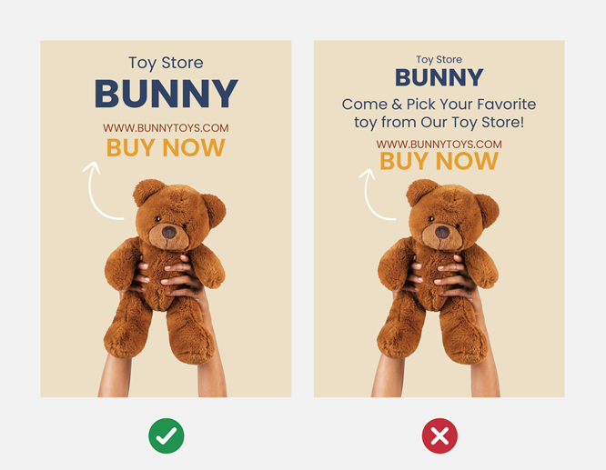
Have a look at the picture below to see the difference between efficient and inefficient prioritizations.

Use Graphics and Images
Another important component of signage is imagery and graphics. Here’s what you need to know about business sign images that succeed.- Keep imagery simple: use high-resolution images that are simple in design and color scheme;
- Avoid collages: this will overwhelm your business sign, making it illegible;
- Remove messy backgrounds: use bright-colored silhouettes.;
- Ensure graphics match your message: the images must match your business message.
We can help you navigate the library of high-resolution stock images on our sign design tool. You’ll find dozens of thematic examples there.

Use Blank Spaces
The blank space, or so-called white space, is the empty area on business signage. It helps the sign breathe and allows the eyes to focus on the message. Blank space adds professionalism and confidence to the sign through a minimalist aesthetic.

Keep the Design Simple
People glance at business signage for 2-3 seconds, especially when they’re driving, walking, or talking to others. You have 2-3 seconds to grab their attention and engage with them. That’s why simplicity is key.
- Use a single icon/image: one piece of imagery doesn’t overwhelm the signage;
- Minimize message: present only one idea;
- Maximize color contrast: it makes the signage catchy;
- Use hierarchy: prioritize what you want your customer to see first;
- Clear fonts: clear scripts are necessary for distant readability;
- Leave blank space: it keeps the business sign balanced and the message noticeable.
Include Clear Call to Actions
Now, when you have designed effective signage that turns heads from miles away, it’s time to make your onlookers act. A CTA tells people what to do after getting the message.
- Short and sharp: 2-5 words are enough for a strong CTA (e.g., “Buy Your Book!” instead of “Come & Pick Your Favorite Book from Our Bookstore!”);
- Prioritized: leave your CTA at the bottom or center of the sign, written in a bold, clear font, and surrounded by blank space;
- Goal-matching: tell people what you actually want them to do (e.g., “Call Now!”, “Visit Us!”, “Don’t Miss Out!”);
- Urgent: use mild urgency instead of desperate calling (e.g., “Today Only”, “Limited Offer”, “Only 5 Seats Left!”).
Effective Sign Design Examples
You already know how to design a business sign like an expert. Now, let’s look at examples of good signage design and analyze them together.
- Coca Cola – Everyone would agree that this Coca Cola signage is excellent. A wall-mounted light-up sign with red/white contrast is an amazing combo. The color scheme creates warmth and makes an instant impression. A high-altitude installation coupled with illuminated features attracts people from a distance.
- Sunmight USA – The Sunmight USA signage stands out for its good hierarchy. The message is presented in a legible script. White space gives it a minimalistic and trustworthy appearance. Background silhouettes are calm.
- Gale Street Grooming – This sign has a good color combination but poor design. It has unclear graphics with lettering far too large for the product size. The contact information is barely visible from afar.
- 11 Ravens – The 11 Ravens is a particularly good example. The black script and logo contrast with the white background. It’s written in a legible script and doesn’t include overwhelming elements.
- Coco & Rachel – Large, golden lettering is showcased against a black wall. It looks retro, elegant, and classy. Despite its tasteful design, it might have poor readability from a distance.
FAQs
How to Design a Sign Layout?
A sign layout is the proper arrangement of sign elements. For a sign layout that works, follow the hierarchy, image, and symbol placement. Involve blank spaces in your design as well.
How to Make Business Signage Stand Out?
Focus on color psychology, simple and readable scripts, blank spaces, and hierarchy to make your business stand out.
Which Platform to Use to Design a Sign?
You can create your business sign using Square Signs. View our detailed guide on how to create a stunning business sign with our tool. The platform offers a big library of designer-made images, symbols, scripts, background patterns, templates, and more. It will also let you reorganize your design by adding, replacing, deleting, or changing elements. The cherry on top is that you’ll also be able to have your design printed on a material of your choice and delivered to you anywhere in the USA or Canada.
What Are the Rules for Sign Design?
Remember that simplicity is key. Follow the business sign design tips. They include good color contrasts and combinations, readable fonts, legible graphics, and symbols. Whatever you include in your design, keep it short and simple.
What are the Most Common Mistakes When Designing Business Signs?
The worst sign design mistakes include:
- Poor color contrast;
- Illegible or small fonts;
- Overwhelming graphics;
- Poor or no hierarchy;
- Long texts;
- Long, weak, or missing CTAs.
These mistakes will bring your branding no success.
Ready to design your sign? Get Started